Table of Contents
- Introduction
- 15 tips to dramatically boost your conversion rate
- Targeting is the Key
- Fine tune your page layout and design
- Use actionable images
- Boost your website speed
- Nobody likes clutter
- Advanced Search or No search
- Reduce form fields
- Work on your CTA copy
- Use contrasting colors for your CTAs
- Make use of Videos
- Create an urgency
- Highlight your Phone number with Large Font
- Add value to your offer
- Add Testimonials and Awards/badges section
- Use Live Chat
- Final words
Introduction
To boost your conversion rates, you might have tried a number of things. Changing design elements. Colors. Text copies. Images. Targeting settings and what not.
But, are you satisfied?
While most websites enjoy an average conversion rate of 2.35%, 78% of business owners want to convert more. And if you are one of them, we’ve got something for you.
15 tips to dramatically boost your conversion rate
1. Targeting is the Key
Do you know your audience? Do you know what they want? Do you know where they are located?
No matter what your business is about, knowing these things will help you target your marketing campaigns and design your products and services better.
Just start off. Analyze your audiences’ behavior. Find their interests. Genders. Age groups and basically everything that you can.
Most of the advertising platforms these days allow advertisers to target campaigns based on a number of demographics.
This is where you use all the existing intel and run a test campaign.
It’ll provide you with more information about your audience just by looking at the breakdown menu in your platform’s ads manager.
For a better understanding, take a look at the following screenshot.
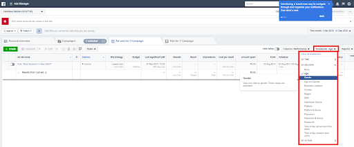
The part highlighted in red is the breakdown menu for a Facebook Ad Campaign. It lets you choose the demographics (age/gender/location etc) that you want to see the campaign’s results for.
It’s easy to find in Facebook ads manager and once you have it, you can acquire useful data for further optimizing your ad campaigns leading to better results.
2. Fine tune your page layout and design
While optimizing your PPC campaign is a thing for boosting conversions, that’s not where the journey ends.
You’d also need to fine tune your landing pages. Making it easy for you, here’s how you do it.
-
Remove automatic image sliders
While the big automatic image sliders on your website are making life easy for your users, it’s not really the case.These image sliders look nice but in reality, they don’t let the users access your website and its information at their pace.Almost all conversion experts suggest that you remove these sliders as they reduce conversions So, instead of using an image slider, place a static offer banner or something that really entices the users to click-through.
-
Remove navigation menus or strategize them wisely
Time and again, we’ve all been hearing that navigation menus kill conversions. And for the matter of fact, it’s no lie.What actually happens is that a navigation menu gives your visitors an option to leave your landing page. And that my friend, shouldn’t be happening until you have a strong backup plan for it.For example, if you really want to use the navigation menus, what you can do is strategize them. Use the navigation menu as a CTA and display the buttons which you want your users to click on.Like maybe a bunch of login options (Facebook, Google, Twitter, etc).
-
Use the right colors
While you are looking forward to boosting your conversion rates the color scheme of your website would matter a great deal.The right colors can make your content easily comprehensible and anything tacky can instantly turn your users off.So make sure your website’s color scheme goes well with its design and theme because it’s really crucial.Also, note that the colors on your website affect readability.If your website’s background and font colors are not fit for each other, users may find it hard to read your content.
3. Use actionable images
When you are designing your landing page, the images that you use can make or break your conversion rates.
Studies show that internet readers pay close attention to information-carrying images. If you use this to your advantage by including well thought, original and creative images you can successfully persuade your visitors.
For example, this Dutch house-selling firm ran an A/B test by replacing just an image.
Their first landing page had an image saying ‘Need help?’.
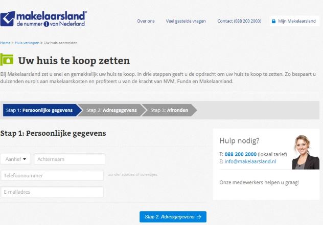
Now, saying something like ‘Need help?’ isn’t wrong at all. It just indicates that you are willing to help. But is it really actionable?
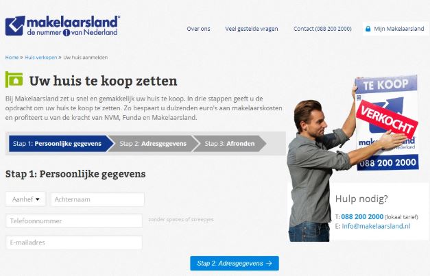
Although the first image was performing fine for them, they wanted to know if they could do better. So, they replaced it with an image of a man placing a board saying ‘Sold’ over the one saying ‘For Sale’.
And it worked. This simple, small change of one image boosted their conversion rates by 89%.
Cool, right? That’s just how it is. You use the right images ~ your visitors start responding better.
Note: Never use stock photos. They are boring. Lame. And take value away from your campaign.
4. Boost your website speed
An average internet user leaves a website that doesn’t load in 2 seconds. Where does your website stand with that?
Think about it. Is your website fast enough? Can its speed be costing you priceless conversions?
In all good and bad cases, it won’t hurt to take a website loading speed test. A number of speed analysis tools out there help find issues with the loading speed providing useful insights on how you can make it better.
And then it’s a really easy process.
For example, if you are using GTMetrix or Google Pagespeed Insights, just paste your URL and hit enter.
A test report displaying all the issues regarding your website speed will appear. All you need to do after this is fix all of these issues one by one.
The most common issues include poor usage of browser caches, parsing of javascript and gzip compression, etc. But nothing to worry about. These issues can be resolved within 10 minutes at the most.
Boosting your page speed can increase pageviews by 11%, user satisfaction by 16% & conversions by 7%. No wonder, it’s something that all businesses need to invest in.
Note: This process may require you to get into the cPanel of your website. If you lack experience with the same, better consult someone who doesn’t.
5. Nobody likes clutter
Never burden your visitors with tons of redundant information.
While the idea of giving out all the necessary details may entice you to the core, turns out, it can cost you conversions.
How?
Well, imagine visiting a landing page loaded with information. Imagine feeling stuck in the web of that information. Imagine yourself in a situation when you are clueless about what should be your next action on that webpage.
Daunting, right? It’ll be the same for your users as well.
So, understand this and don’t give your users what you won’t want to have on a landing page that you visit.
Better get to the point. Keep your webpages as clean and comprehensible as possible.
And if you have doubts about what a cluttered and distractingly loaded landing page looks like, we got it for you.
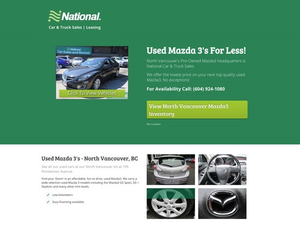
While in the first look it may look like a normal landing page, a few things could’ve been made better.
Like, the layout could be more cohesive. They could’ve used a better headline (something like ‘Get the best deals in the city on Mazda 3s’). And the information on this page, it looks cluttered, unstructured and incomplete. They could sure fix that to boost conversion rates.
In fact a better landing page for selling cars could look like the one below.

This page is free from clutter. Has a simpler and more cohesive layout. Looks complete. And is easy to go through with a prominent lead form. Just how a good landing page should be.
6. Advanced Search or No search
Time and again we’ve all been hearing that a landing page should never have any distracting elements. And for that reason, despite being a useful asset to any normal webpage, a search bar is generally a misfit for landing pages; until it’s an ‘advanced search’ bar.
And what is advanced search?
Well, have you ever noticed how search works on websites like Amazon and eBay?

Both these platforms and several others provide an advanced search option. It enhances the user experience by displaying a number of product feature options to choose from.
For example, the moment you make a search with the keyword “smartphone”, hundreds of search results appear.
Here, the advanced search feature enables you to filter these search results based on your specific needs like your budget. The brand of your choice. Screen size. Operating system. RAM. ROM. And almost everything else that you can think of!
And that’s how it makes any buyer’ journey easy. By letting them sort everything as they need. And by giving out choices that don’t only entertain them better but also lead them to those of your products which they are most likely to buy.
7. Reduce form fields
Can you recall the number of times that you stopped by to fill out a 4-page form on the web?
Sure, we’ve all done it for bank documentation, college, and hospital admissions and for a bunch of other similar paperwork. But, are we really willing to do that for a website making money out of us?
Let us take an example. You click through an enticing CTA used with a great offer. Now, you may be expecting something useful against it. And then the CTA takes you to a large form with 10-15 form fields.
What are the odds of you filling that out unless it’s really important?
We live in a world of 8 second attention spans. A long form doesn’t help here.
Understand this. Shorten your sign-up forms. Be as crisp as you can be. And you will see the results flowing in.
For example, Neil Patel uses this amazing spin-wheel to collect email addresses from visitors coming to his blog.
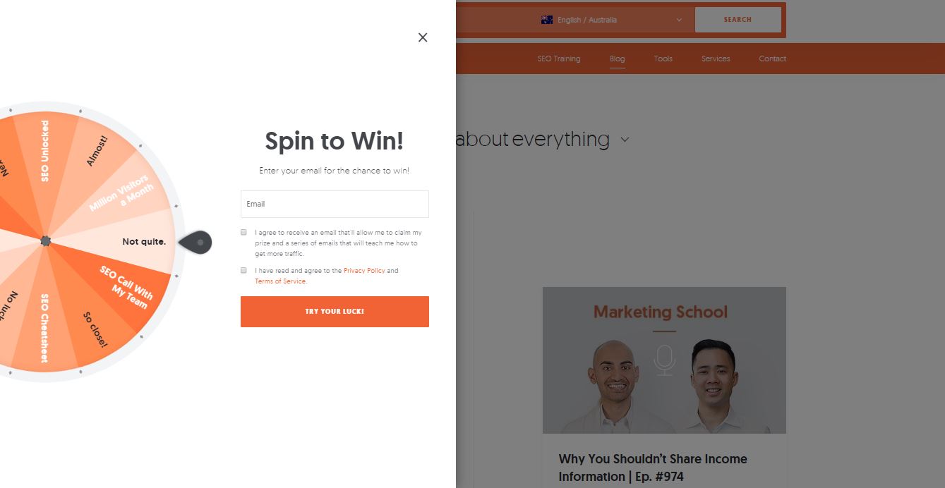
You enter nothing but your email address and spin. The wheel will show what you’ve won and whatever it is, it’ll be mailed to you; RIGHT AWAY!
Now, this is an offer. This is a CTA. This is a lead magnet.
And you can do it too. Just think of a clean and concise form with not many form fields.
8. Work on your CTA copy
While every single element on your landing page plays a vital role, CTA is one of the major game changers for conversion campaigns.
Why?
Well, this is the place where your visitors will click through. This is where you will be pushing your prospects down the conversion funnel from. This is your stairway to heaven.
So, pay enough attention to it because the right CTA can convert 42% more visitors into leads.
And as you try to optimize your CTA to the max, here are a few tips that you can use.
-
Never use a normal textual link
One of the biggest mistakes that you can probably make with your CTA is to use a link instead of a button.Just as mentioned above, CTAs are really crucial for conversions and so they need to be taken seriously.While using a link is an easy way out, turns out easy isn’t always the best alternative.Keep this in mind. Don’t risk your conversions over anything at all. Think of a good button design and go for it.Note: Use a design that gels well with the page and is distinctly visible at the same time.
-
Write actionable CTA copies
Another brick in the wall, you really need to come up with good CTA copies.Something that doesn’t impose work. Something that doesn’t inflict any unnecessary authority. Something that’s polite but compelling.While normal phrases like ‘Read More’ or ‘Fill this Form’ or ‘Buy me a Drink’ are commonly used, turns out they don’t really perform that well.The thing is that these CTAs impose work. Reading more is work.Filling out a form is work. Buying you a drink or coffee or whatever else is work plus generosity. What reason do you think your visitors will have, to do you these favors?Think about it and come up with better CTAs that offer your visitors something.For example, instead of a ‘Read More’, you can try saying ‘Find out’ or instead of saying ‘Fill out this form’ you can try saying ‘Sign Up for Free’.Try. These little things can largely determine your conversion rate success.
9. Use contrasting colors for your CTAs
You might have read a number of case studies saying a red color CTA converts better than a green one. But does this mean you should go for a red one mandatorily? Not exactly!
It’s like when someone says that changing the button color from green to red improved their conversions by 32.5%, they are talking about the better contrast and not the actual color that improved the conversion rate.

So, understand this. Contrast plays a vital role in switching ‘ON’ the actionability of your CTA. In fact, it’s best to pick a CTA color that hasn’t been used anywhere on your landing page.
10. Make use of Videos
When people hear information, they’re likely to remember 10% of it three days later. However, if a relevant visual is paired with the same information, people can recall almost 65% of it three days later.
And you need more reasons to use videos?
Don’t stall it further. Start using the right kind of videos that are suited for your landing page.
For example, a good explainer video can perform really well to convert your prospects at the initial stages of your sales funnel, just like it did for Dropbox.
‘In its starting days, Dropbox had faced disappointment with the paid search ads. So, they’ve had a change of plan.
Drew Houston, the founder of Dropbox had earlier used a demo video to validate the idea of Dropbox in the market. The video performed pretty well for him for which he said:
“It drove hundreds of thousands of people to the website. Our beta waiting list went from 5,000 people to 75,000 literally overnight. It totally blew us away.”
Now they knew that something else too could work. So, Drew contacted a professional video company and came up with a good explainer video.
This 2-minute video that cost less than $50,000 in 2009 boosted their conversion rate by 10% leading to 10 million extra customers yielding an ROI of $48,000,000 in extra revenue.’
Brilliant, right?
Well, this was just one example. There’s a number of others where explainer videos caused a big bang of sales for businesses across different niches.
For your business, you need to save yourself from missing out on this big opportunity and cash it right away with a video that’s spot on for your conversion campaign.
11. Create an urgency
We know how the crowd on the internet is; ‘a bunch of impatient individuals jumping from one webpage to another’.
While there’s nothing wrong in it, this simply adds another hurdle to the conversion process.
The visitors may not always take your offer seriously. They may not click through your best CTA copies. They may just not be in the right head or mood to be converted. And then a number of other odds?
Your best bet?
Use reverse psychology.
Before your visitors realize that they are too busy to walk the next step down your funnel, tell them they are running out of time.
Now, hold on a second. You don’t have to blatantly say that out loud.
Create an urgency. Tell them if they don’t quickly take action against your offer, they might lose a lot. And, if you can, then tell them what they are going to lose.
You can use an offer timer or phrases like ‘Just 2 Items left’ (if yours is an e-commerce store).
For example, this e-commerce website used this timer offering a discount to the customers placing their orders within 15 minutes.

Simply something that can boost conversion rates real quick.
Think about it and see how you can use it to boost conversions on your website.
12. Highlight your Phone number with Large Font
When you are looking forward to converting more, you don’t particularly want to convert just through your sign-up forms.
Conversions are conversions. Whether they come through a sign-up form or through a phone call.
Keep this in mind. Adding your phone number on your landing page will help you in the following ways.
- It adds credibility and tells your visitors that you are easily approachable
- It provides your prospects (visitors) one more medium to reach out to you (which is awesome and boosts your chances of converting)
Also, make sure you add your phone number in huge font. Most brands do this to highlight it better.
See how Crackitt does it for all of its webpages.

13. Add value to your offer
“A Mediocre copy and a good offer can always out-pull a great copy and a mediocre offer any day. So, make a good offer and if your grammar isn’t correct, if your spellings are wrong, or even if you have red text on a green background, you still might convert.”
– Breakthrough Copywriting by David Garfinkel
Do you get what it means?
If everything else in your conversion campaign is being done right and you are still struggling for results, something can be wrong with your offer.
Basically, if your product’s perceived value isn’t greater than what your customer is to pay, conversion rates will stay low.
You know what to fix now?
Get into your customer’s shoes. Fix everything with your offer. If the price is too high, you’d know it, so cut it down. If they doubt your products’ quality, give them proof to believe in your product. If there’s anything else that’s needed, find that thing and give it out.
The idea is to sell. And to be useful after the sale.
14. Add Testimonials and Awards/badges section
Just as discussed in the previous section, it is good to provide proof of quality. And it works best when not you but your clientele says it.
That’s what the testimonials section is for.
So, do you have one for your landing page? Well, if not, then this is the time you get one.
Start with asking your clients for feedback on your services/products. Ask them what they liked? How did it work for their benefits? If they have any stories to tell regarding your product?
Once you publish appreciative words from people you worked with, your prospects will know that your services/products helped someone, so those can help them as well.
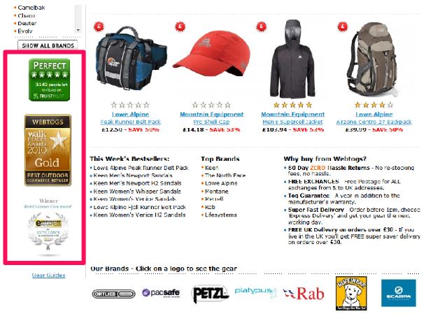
Also, you can display the awards and badges that your organization has earned over all the years of functionality.
This increases credibility and boosts conversions. No wonder, websites like webtogs do it too.
15. Use Live Chat
You have a decent user base. Good search rankings. Your campaigns are driving loads of web traffic to your landing page. But then you lost a few customers as no assistance was available when they needed it.
While losing a few sales here and there may not always look like a great deal, it can always nip it in the bud in the long run.
The best way you can ensure that your landing pages are optimized to the fullest is by adding a live chat option.
This is a feature which can greatly add to your conversions.
First of all, providing a live chat feature on your website/landing pages will help you to resolve your visitors’ queries/issues the moment they crop up.
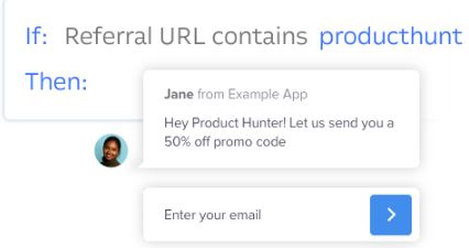
Secondly, a live chat in itself is pretty useful for collecting email addresses from users.
Many websites do this. They provide a live chat feature and right before you mention your concern, you have to enter your email address.
You can look at the screenshot below for a clearer understanding.
Also, consumers using their live chat feature have a 15% higher average order value than other customers.
Final words
While your business may be having a tough time trying to boost conversions, it’s not something that can’t be eased out.
In this post, you read about 15 of the most effective conversion optimization techniques that can work wonders for you even on a bad day.
Hopefully, this helps you better your conversion campaigns.
Still have doubts? Don’t hold back. Share and discuss this piece with your marketing buddies. It will help.
FAQs
How To Calculate Conversion Rates?
Calculating your conversion rate is absolutely easy.
- Take the number of conversions and divide that by the total number of visitors.
- Convert that figure into a percentage.
That is how you calculate conversion rates. Let us share an example.
If you had 40 conversions from 800 interactions, your conversion rate would be 5%.
40÷800 = 0.05 or 5%
Why Are Conversion Rates Important?
Conversion rate is one of the most crucial metrics that help determine the success of an online marketing campaign.
- It helps you understand whether your marketing efforts are working or not.
- It further helps you create better marketing campaigns for social media and other channels.
- It allows you to compare the performance of your marketing campaigns across various advertising channels.
- It also helps you fine-tune your mobile user acquisition campaigns.
How To Improve Conversion Rates?
There are several ways to improve the conversion rates of your marketing campaigns:
- Define your site’s goals and compare them against visitor behavior.
- Collect and analyze visitor data to improve your marketing efforts.
- Analyze competitors’ performance.
- Evaluate your current conversion funnel.
- Define your value proposition and highlight it in your marketing materials.
- Optimize the page layouts for critical pages.
- Build trust with user-generated content such as reviews and testimonials.


